Today I had the privilege of photographing part of Portuguese history. I spent my day at Viarco’s archives. I put up a small clandestine studio so I could take the best possible photos I could.
wanna se a preview of what’s coming?

Today I had the privilege of photographing part of Portuguese history. I spent my day at Viarco’s archives. I put up a small clandestine studio so I could take the best possible photos I could.
wanna se a preview of what’s coming?
This workshop was some kind of lifesaver! Before I wanted to do something about Viarco and now I know what I actually want to do.
By creating a research question I was able to identify why I should do this and how I should approach the theme. I discovered that I wanted to work with nostalgic brands, but not only that. I wanted to work with brands that are so deep in part of portuguese people that they become an identity itself… was that clear? no?… well maybe the actual question will be more helpful.
“How can a brand be part of a national identity?”
In the end I ended up designing a poster that could transmit this. I got really happy with the result. Conceptually I think it was pretty powerful, unfortunately the graphic design part could use a little touch. Nevertheless this is how it looked.

The photo is part of portuguese history, in it are represented the two main symbols of every countries identity: the National Hymn (sang by the kids), and the Flag.
There are a lot of other concepts in the poster, like the fact that these kids only use portuguese brands and the fact that, today, they are our grandparents and passed down their history to us.
I finally have a theme for my thesis!! yey
Drum roll………
I am going to make a museum book for Viarco. The main object of this is to make the memory last of what was once a great industry, and to pay tribute to everyone who were part of it.


Before I start posting about this new year, I wanted to show at least a picture of how my vitrine looked in the end.
The project was a success, and it was really cool to see my beautifully crafted ( 😀 ) letters on the window. During the time it was on, I saw a lot of people taking photos and that made me really happy.

My first idea was to create a giant abacus into the vitrine.
The abacus was used as a calculator in the old days. I would design (in vector) the main sold products in the store and then I would cut then in wood.
The abacus usually have small balls to count the numbers but in this case they would be replaced by the store products, this may be a problem because people won’t realize that it is an abacus.

It’s been a long time since I posted something here. Therefore I will start with how my current project began.
At the moment we are designing a vitrine for some shops in Oporto downtown. I got Mosaico de Sabores which is a portuguese gourmet kind of store. They call themselves “contemporary marketplace”.

This gallery contains 11 photos.
Here are some photos of how my foldable explaining the Life Cycle of a Star. Because I haven’t posted anything about this foldable I will explain it here. I wanted to design a piece that could explain how stars are … Continue reading

This gallery contains 6 photos.
I have been posting the process of my work. In this post I will show how my infographic about Sci Fi trilogies turned out.

I haven’t yet uploaded the result of my Pop-up Shop result, therefore here it is, the complete story behind the project.


 Somehow it all started as an attempt to create an object that “isn’t what it appears to be”, unfortunately because of technical difficulties this intention couldn’t be finalized.This object I am talking about was a utopian idea of removing the functional use of latex washing gloves and present them with a new aesthetical look. I would cut the gloves so that they became really beautiful objects though not actually being. Due to financial costs in production of this object, this idea was put aside.
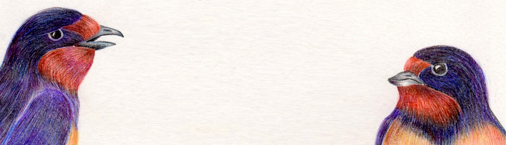
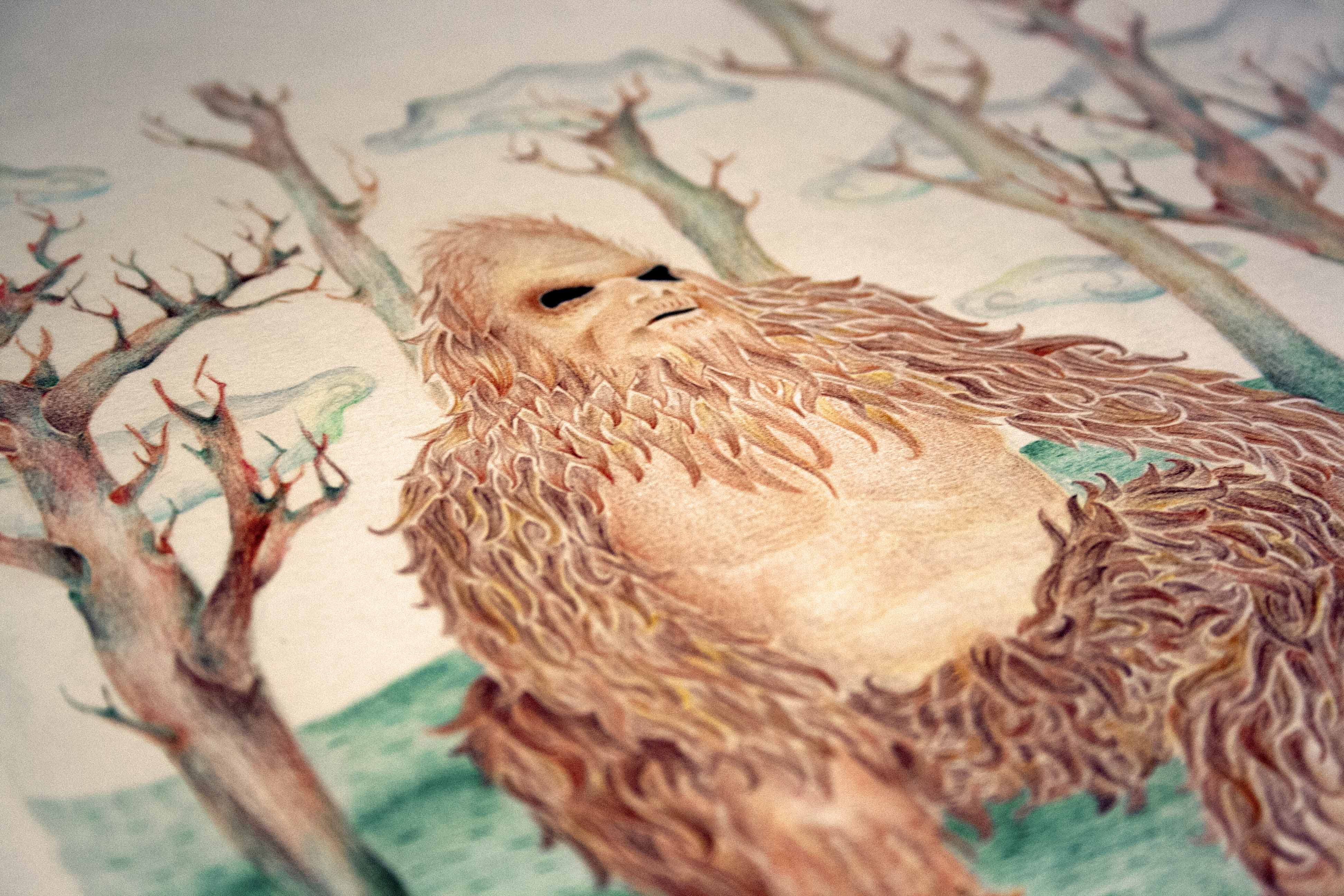
A brainstorming session happened, with the purpose to find my project. Time was running out. I wanted to do something related to my areas of interest outside of graphic design, one of them are the studies of pseudoscience, like cryptozoology, which is the study of creatures whose existence wasn’t proven. Throughout the latest years I collected websites and articles of people saying that they saw one of these creatures, like the Chupacabra or the Loch Ness Monster. I made some posters with colour pencil illustrations based on these testimonials.
I spend a few weeks making the drawings, because I wanted them to have a scientific illustration look. I also made letterings with the titles of the creatures.
These Creatures were:
The Kraken
La Chupacabra
The Loch Ness Monster
The Big Foot
Because people who bought the posters wouldn’t just take them unprotected therefore I made some packaging to avoid the posters from wrinkle or folding. I found some cardboard tubes ESAD kept and they gave some to me, and I went to the wooden workshop and cut them, so that the poster would fit nicely. Afterwards I design a small sticker with the project lettering and went to the screen-printing workshop and printed them in white.
The only thing to finish was the texts of the creatures and to scan the pictures and put them in the posters, because the layout was already designed. I finished the texts and started scanning the illustrations.
The final day was upon us and the project was ready on time, despite a little more time would have been nicer to photograph the illustrations.
Fortunately I profited from the project, and I look forward to, in the future, illustrate some more of these creatures and perhaps make a publication with them.
And here they are:


For my third and final way of seeing stars I’ll make (as said before) an info graphic abou Sci Fi movies. In the beginning I was going to make a visual comparison about sic fi movies and series (being me a great fan of ’em). Nevertheless, in the end I decided to only compare some of the most known sci-fi space based trilogies – Man in Black, Star Wars, Star Treck and Alien.
